#folio verlag
Explore tagged Tumblr posts
Visit Tumblr Blog
Explore Tumblr blogs with no restrictions, modern design and the best experience.
Last Seen Tumblr Blogs


olympusimpuritiesstandard-blog
Olympus Chemicals & Fertilizers | Impurity Standard Supplier
16 posts
Fun Fact
Tumblr has 4 main sources of revenue.
Text

ein mysteriöses, fast zwielichtiges vor allem aber düsteres szenario ziert das cover von garten der engel. passend ausgewählt von groothuis, spiegelt das düstere doch sehr gut die zeit wider, in der der roman spielt und das zwielichtige die umstände, in denen sich die widerstandskämpfer bewegen mussten, um nicht entdeckt zu werden. eine unaufgeregte, ansprechende gestaltung.
#garten der engel#david hewson#folio verlag#roman#coverdesign#philosophenstreik#groothuis#Umschlaggestaltung#literatur#rezension#tobias bruns
0 notes
Text


Manuscript Monday
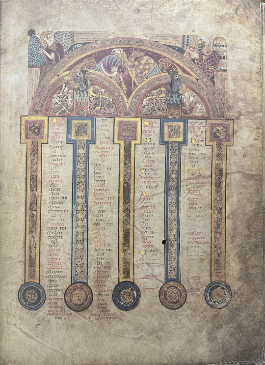
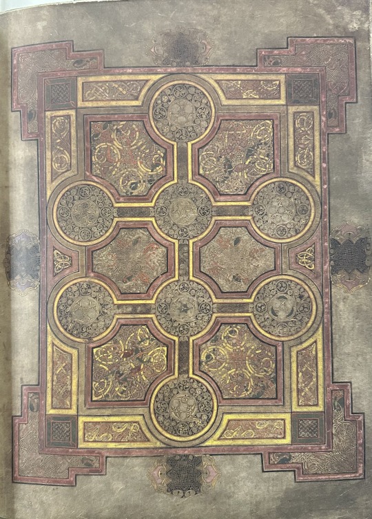
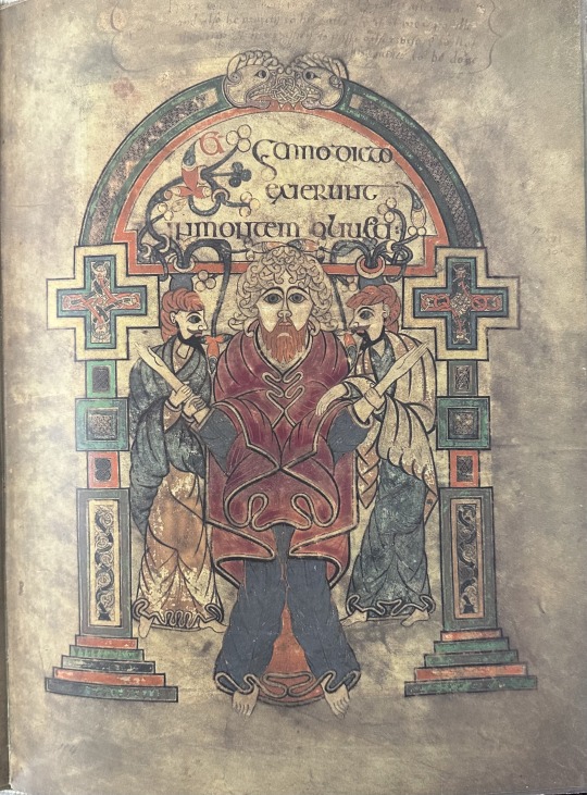
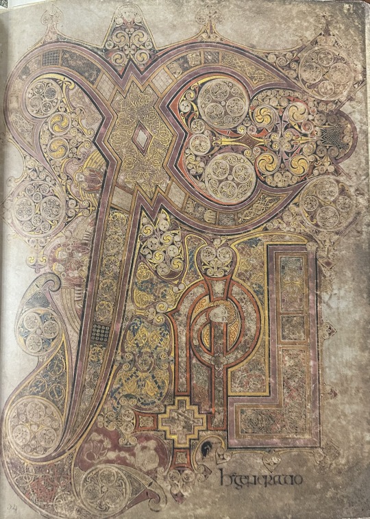
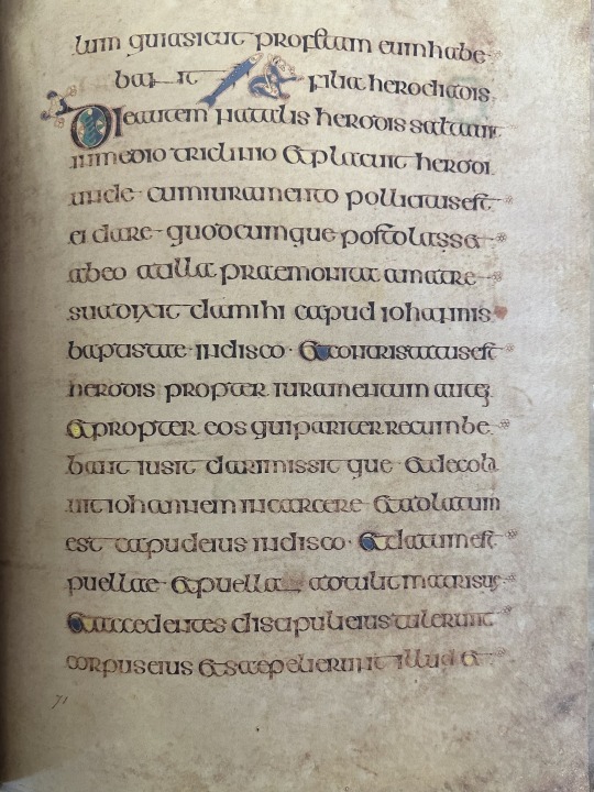
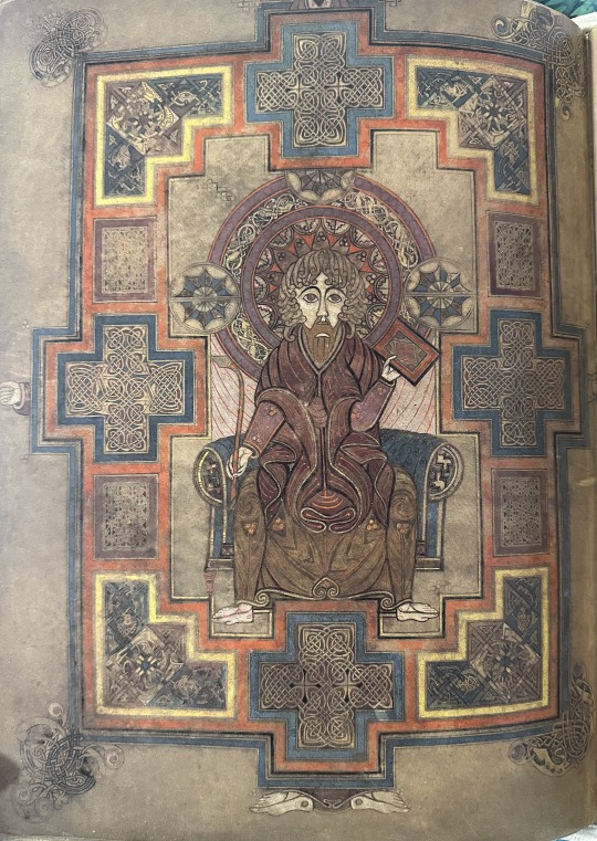
This Insular manuscript was created by Irish Catholics, who were well known to be stewards of knowledge and artistic ability during the ‘dark ages’ of the 6th-10th centuries CE. In particular, the Insular style consists of flattened, two-dimensional figures of people and animals accompanied by elaborate ornamentation throughout its pages. We often see interlacing designs and Celtic knots within this ornamentation and the proportions and rendering of the figures and architecture seen throughout the manuscript are not always realistic. For example, in the Book of Kells, produced around 800 CE by Irish monks in Scottish west-coast island of Iona, the columns holding up the arches on canon tables are circular and would lack structural integrity in the real world, for obvious reasons. We can see the flattened, strange rendering of figures on folio 32v (shown below), which is a depiction of Christ Enthroned. Christ’s knee is lifted to hold up the codex in his hand, but the placement of his knee is anatomically incorrect. We also see the flatness of the figure and the inclusion of ornamentation throughout the image, and we can see even more of this decoration on carpet pages throughout the manuscript. The Insular style was not only limited to manuscripts but was also used in metal objects like broaches, chalices, sculpture, and architecture which are also said to have been inspiration for Insular style manuscripts.
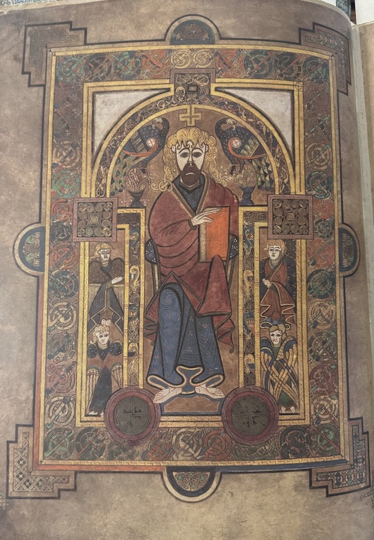
Our copy of the facsimile of the Book of Kells was published by the Faksimile Verlag of Luzern, Switzerland in 1990 and includes a separate volume with commentary edited by the noted Trinity College librarian Peter Fox. If you have the urge to see the original Book of Kells, it is shown in the Trinity College Library in Dublin. The library shows two folios of the manuscript at a time and changes the pages shown every twelve weeks.
View more Manuscript Monday posts.
– Sarah S., Special Collections Graduate Intern
#manuscript monday#book of kells#ireland#kells#illuminated manuscripts#manuscripts#facsimiles#Faksimile Verlag#iona#insular#insular style#carpet page#canon table#trinity college#Peter Fox#trinity college library#dublin#Sarah S.
90 notes
·
View notes
Text
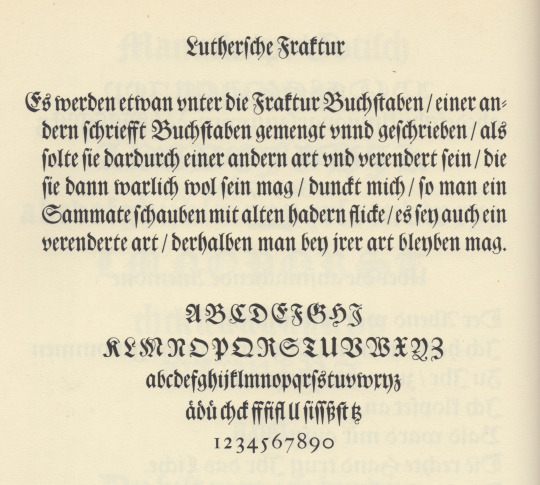

luthersche fraktur
first illustration is from plate 122 in jan tschichold’s excellent source book Meisterbuch der Schrift [otto maier verlag, ravensburg, 2nd ed., 1965]. in the note to the plate tschichold tells us [translation mine]: «Fraktur, the script of the German Renaissance, was utilized unchanged in the baroque until into the rococo. The example before us, a cut originating with the famous, ancient Frankfurt type-foundry Egenolff-Luther, is the most noble of still available ancient fraktur types. The plate shows the gorgeous Text-size, which first turned up in 1708 on an Augsburg type specimen. The typeface now belongs to the type-foundry D. Stempel AG in Frankfurt am Main.» text-size is the old founders’ specification for a casting-mould (body-size) of approximately twenty didot points—approximately twenty-four english-american points. i always read tschichold as gospel, but why does tschichold refer to «the 1708 specimen»—publisher‘s name? the text-size certainly appears on the 1678 luther foundry fraktur-specimen.
second illustration is a section from Fraktur-Schriftprobe des Schriftgießers Johann Erasmus Luther, Frankfurt a. M. 1678 [plate 9 in Frankfurter Schriftproben aus dem 16. bis 18. Jahrhundert, d. stempel ag, frankfurt am main, 1955]. in his introduction to the folio, dr robert diehl notes [translation mine]: «However, also a new proprietary cut of fraktur face was begun under the directorship of Erasmus Luther. It became known by the name Luther fraktur, and was later recut & reissued by the type foundry D. Stempel AG in Frankfurt.» [ibid., introduction, p4]. stempel acquired the type- foundry department of w. drugulin, the famous leipzig printing company, in 1919; & drugulin held matrices of original luther fraktur. stempel issued its luthersche fraktur revival that same year.
7 notes
·
View notes
Text
Italia, dove vai?
"Italia, dove vai?" („Italien, wie weiter?"), wird am Donnerstagabend in der Romanfabrik im Rahmen der Frankfurter #Buchmesse diskutiert. 2024 ist ein gutes Jahr für italienische Autorinnen. Reihenweise werden fast vergessene von ihnen wieder entdeckt.
Italien ist das Partnerland der diesjährigen Frankfurter Buchmesse. Eine Antwort auf die Frage „Italia, dove vai?“ („Italien, wie weiter?”), die Giulia Caminito heute Abend mit den Schriftsteller:innen Melania G. Mazzucco, Francesca Melandri, Mario Desati, Gianrico Carofiglio und Paolo Rumiz, allesamt Autorinnen und Autoren der Verlage Folio und Wagenbach, vor ausverkauftem Haus in der��

View On WordPress
#Alba de Céspedes#Anna Maria Ortese#Caminito#Dacia Maraini#Dolores Prato#Donatella Di Pietrantonio#Francesca Melandri#Frankfurter Buchmesse#Gianrico Carofiglio#Giulia Caminito#Goliarda Sapienza#Igiaba Scego#Italien#Mario Desati#Melania G. Mazzucco#nonsolo Verlag#Paolo Rumiz#Premio Strega#Radici nel futuro#Sibilla Aleramo.
0 notes
Text

Hier liefert uns der Taschen Verlag wieder ein hervorragendes Buch in bibliophiler Qualität, das auch von der Größe her fast ans Folio-Format heranreicht, aber zumindest als Groß-Quart bezeichnet werden.
0 notes
Text
Grenzenlos: Die erstaunlichen Wanderungen der Tiere
Grenzenlos: Die erstaunlichen Wanderungen der Tiere
Buchvorstellung von Silvia Slazenger lGrenzenlos – sind die erstaunlichen Wanderungen der Tiere, die Francesca Buoninconti in ihrem gleichnamigen Werk beschreibt. Grenzenlos scheinen auch die vielen Wege, Formen und Strategien dieser Wanderungen zu sein, wenn man sich in einem nicht endenden Staunen durch die Kapitel liest. Doch beginnen wir ganz von vorne. Seit wann wissen wir eigentlich wie…

View On WordPress
#Buchvorstellung#Die erstaunlichen Wanderungen der Tiere#Folio#Folio Verlag#Francesca Buoninconti#Grenzenlos#Grenzenlos Die erstaunlichen Wanderungen der Tiere#Jagdblog#natal homing#Rezension#sardine run#Silvia Slazenger#Tierwanderungen#Warum Tiere wandern#Wie Tiere wandern
0 notes
Text

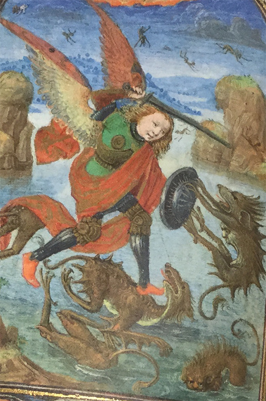
Time for medieval monsters! Demons and dragons, fanciful centaurs and unicorns - monsters played a central role in medieval societies, with many appearing on the pages of illuminated manuscripts. Check out the dragons and sea creatures in the Prayer Book of Charles the Bold.
Prayer book of Charles the Bold is a small book, measuring 12.4 × 9.2 cm (4 7/8 × 3 5/8 in.) The miniatures are incredibly detailed and require close looking. The. In the Fine Arts Library’s Special Collections, we have a facsimile of the original illuminated manuscript, which is in the collection of the J. Paul Getty Museum in Los Angeles, CA.
Das Gebetbuch Karls des Kühnen = The prayer book of Charles the Bold = Le livre de prières de Charles Téméraire Variant title Prayer book of Charles the Bold Livre de prières de Charles Téméraire Luzern : Faksimile Verlag, c2007. 1 v. (unpaged) : col. ill. ; 14 cm. + 1 commentary (310 p. : ill. ; 25 cm.), Facsimile Summary Small, elegant, prayer book commissioned by Charles the Bold in the 15th century contains 159 folios with 47 color miniatures which is the work of Flemish painter Lievin van Lathem and scribe Nicolas Spierinck. Language: Latin Author / Creator Schryver, Antoine de. Lathem, Lievin van, active 1454-1493. Spierinck, Nicolas, active 1455-1499. J. Paul Getty Museum. Department of Manuscripts. c2007 HOLLIS number: 990101673590203941
#Medievalmonsters#Medievalart#dragons#fright#monsters#illuminatedmanuscript#prayerbook#prayerbookofcharlesthebold#facsimile#specialcollections#HarvardFineArtsLibrary#Fineartslibrary#Harvard#HarvardLibrary#harvardfineartslibrary#fineartslibrary#harvard#harvard library#harvardfineartslib#harvardlibrary#special collections
133 notes
·
View notes
Photo

HAAN, Karl de. Happy Sunday. Luzern and Frankfurt am Main: Verlag C. J. Bucher, (1969). Folio (349 × 269 mm), pp.[120]. Black-and-white photographs. Plain endpapers. Red cloth-covered boards, titles to spine and front in gold; light spotting to first and last leaves, and endpapers, foot of spine bumped gently. Colour photo-illustrated dust-jacket, text in black; light creasing to head and foot of spine, light wear to edges, light spotting to verso. Publisher’s card slipcase; one corner lightly bumped, toning to edges with light spotting. An excellent copy in a very good example of the scarce original slipcase. First edition. Karl de Haan was born in 1929 in Java, Indonesia to a Dutch father and Austrian mother. He lived and worked in the Netherlands, South Africa, the USA and St. Maarten, beginning his career in advertising and display before starting his own studio for fashion and commercial photography in 1965. He toured Rhodesia extensively between 1966 and 1968 and opened a studio in Brussels in 1969 before returning to Johannesburg, where he had settled in the 1950s. Happy Sunday contains a series of erotic photographs of a girl named Sue over the course of one imagined day.
43 notes
·
View notes
Text
Emma Smyth Folio One Section Two: Week Two Collage Artist Research
15/11/2020
HNC Contemporary Fine Art and Photography
Hannah Hoch
Biography :
Hannah Hoch was born as Anna Therese Johanne Höch into an upper-middle-class family in southeast Germany on November 1, 1889 and died May 31, 1978 - Berlin, Germany. Hannah’s father, Friedrich was the supervisor of an insurance company and her mother Rosa was an amateur painter. She studied at the local girl's high school, however Hannah had to leave when she was 15, as her parents rather her to stay at home and look after her youngest sister.
Six years later, in 1912 she joined the School of Applied Arts in Berlin. Here she studied glass design and became interested in the applied arts and design. The school was closed due to the First World War in 1914, and she returned to her hometown to join the Red Cross and help with the soldiers.
Hoch was able to return to Berlin in 1915 after joining the Red Cross, and there she studied graphic arts at the School of the Royal Museum of Applied Arts under Emil Orlik. During 1915 she met the Dadaist artist Raoul Hausmann and their friendship developed into a romantic relationship. Hoch also became good friends with the artist Kurt Schwitters, who added the final "H" to her adopted name of "Hannah,".
Analysis and context of work
Early Period:
Between 1916 and 1926, Hoch worked for the magazine and newspaper publishers Ullstein Verlag. She worked in the department that focused on handicrafts and designing patterns for crochet, knitting and embroidery. The same year, Hoch and Hausmann took a holiday to the Ostsee, where she later discovered the concept of photomontage that would be perfect for her artistic practice. They found images of German soldiers with their faces pasted onto the bodies of musketeers. Hoch noticed the power of collage to alienate and almost distort images that would then give them new meanings.
During the late 1910s and early 1920s she was part of the Dada movement in Berlin. She was the only woman to have been involved among this group of creative innovators and would-be avant-garde cultural revolutionaries.
Hoch liked to borrow from popular culture, dismemberment and collage fitted well with that of the Dadaists, the union was slightly uneasy, the inherent sexism of the movement was a big part to this uneasy feel. She also felt uncomfortable within the Dada circle and was embarrassed by the behavior of some of her fellow colleagues.
Middle period:
Towards the end of the 1920s, she had separated from the Dadaists group and was starting to make connections with other artists such Piet Mondrian, Tristen Tzara and Laszlo Moholy-Nagy, and was influenced by the De Stijl movement.
Late Period:
During this time in Hoch’s career, she separated from many friends including work associates. Her work moved away from figurative montage to a more abstract style which was quite popular with other artists at the time. Hoch’s pieces weren't well known at this time and were not received well by critics.
Hoch became involved with art historian Dawn Ades visited whilst in her Berlin home in the early 1970s. Hoch discovered that he was interested in nature as much as she is interested in art. This inspired her work during this time as she incorporated twigs, leaves and many other aspects of nature into her collages.
Bibliography:
https://www.theartstory.org/artist/hoch-hannah/life-and-legacy/
1 note
·
View note
Text
"Middle England": Nostalgie im Gartencenter
“Middle England”: Nostalgie im Gartencenter
Bild von Johannes Plenio auf Pixabay
EIN GASTBEITRAG VON VERONIKA ECKL
Am Abend vor dem endgültigen Austritt Großbritanniens aus der EU rief mich mein italienischer Freund Paolo an, der als Professor an einer mittelgroßen englischen Universität in einer mittelgroßen englischen Stadt unterrichtet. Paolo verkündete mir, er werde nun ins Pub gehen und sich betrinken, um das Ereignis gebührend zu…
View On WordPress
0 notes
Text
Constellations Through Time
The Special Collections Department is featuring articles written by our student staff in conjunction with our current exhibit, The Compleat Angler: And Other Meditations on the Art and Philosophy of Fishing, 15th Century to the Present, which is currently located in Hillman Library, Third Floor, Room 363, Special Collections Department, University of Pittsburgh.
People have always been fascinated by the heavens and the constellations in them, whether that be for navigational and calendrical purposes or out of sheer wonder. Conceptions of the planets and the constellations surrounding them initially began as geocentric (orbiting the Earth), then switched to heliocentric (orbiting the Sun). A rare work in Archives & Special Collections discusses a hybrid theory, proposed by Aratus of Soli, a Greek poet of the third century B.C., in his Phaenomena. Aratus based his theory and poetical work on the writings of Eudoxus of Cnidos, whose original manuscript has never been recovered. Aratus’ theory is geocentric, but has Mercury and Venus orbiting the sun. In 1600, a seventeen-year-old Dutch prodigy, Hugo Grotius, edited Aratus’s Phaenomena and compiled it together with many other translations, one even by Cicero, which culminated in the Syntagma Arateorum, or The Works of Aratus. It was published by the Plantin Press in Brittenburg.

Title page of the Syntagma Arateorum, 1600.

Portrait of young Hugo Grotius by Jacob de Gheyn II, early 17th century. Courtesy of the National Portrait Gallery, London.
Hugo Grotius enlisted the help of Jacob de Gheyn II, a noted Dutch artist, in order to produce the spectacular engravings and illustrations in the Syntagma Arateorum of 1600. The illustrations are based upon a ninth century illuminated manuscript of the Phaenomena by Aratus that was translated by Germanicus. Germanicus may have been the father of the Roman Emperor Caligula, or could have even been Emperor Tiberius himself. This manuscript is currently held at Leiden University, and is known as the Leiden Aratea.
The Frick Fine Arts Library has a facsimile of the Leiden Aratea in its collection. The illuminations in the manuscript include many sea creatures, both real and imagined, among others.

Pisces illustration from the facsimile edition of the Leiden Aratea, 1987.

Pisces engraving from the Syntagma Arateorum, 1600.
“Beyond Aries lie the twin fishes, of which one stretches towards the region of the South Wind, the other seeks the region of the North Wind, that comes from Thrace….Their movement is not free, but each is held by a chain at the tail, the chains being joined…[by] one knot.” –Germanicus’s description of the Pisces constellation (Katzenstein and Savage-Smith, 27).

Cetus (the sea-monster) illustration from the facsimile edition of the Leiden Aratea, 1987.

Cetus (the sea-monster) engraving from the Syntagma Arateorum, 1600.
“Cetus is the monster sent by sea-nymphs to torment the land of Cassiopeia and Cepheus. As the monster rose from the sea to devour Andromeda, who had been offered to it as a sacrifice, it was destroyed by the hero Perseus.” – (Katzenstein and Savage-Smith, 32).

Piscis Austrinus illustration from the facsimile edition of the Leiden Aratea, 1987.

Piscis Notius engraving from the Syntagma Arateorum, 1600.
“There is a fish that swims alone, apart from the twin fishes.” It was believed that the fish in the Pisces constellation were the offspring of the Piscis Austrinus constellation (Katzenstein and Savage-Smith, 32).
The de Gheyn illustrations were in many cases considered more valuable than the entire Syntagma Arateorum. This resulted in many copies of the Syntagma Arateorum being dismembered and sold for the individual plates themselves. The Archives & Special Collection’s copy is complete. Jacob de Gheyn’s illustrations also had longevity and relevance long after the publication of the Syntagma, in the same way that the illuminations in Germanicus’s manuscript were the inspiration for de Gheyn’s engravings. One of de Gheyn’s engravings was the direct inspiration for a plate in a cosmological atlas, the Harmonia Macrocosmica. This star atlas was written by Andreas Cellarius and was first published in 1660 in the Netherlands. Archives & Special Collections has a 1708 edition, which the following photos derive from.

Aratus’s constellation and zodiac chart from the facsimile edition of the Leiden Aratea, 1987. The goddess Tellus at the center represents the Earth.

Jacob de Gheyn’s engraving of Aratus’s conception of the constellations and the zodiac from the Syntagma Arateorum, 1600.

The Harmonia Macrocosmica is a compendium of the various astronomical theories in use at the time of its publication, including those of Ptolemy and Aratus. Jacob de Gheyn’s engraving, based on Aratus’s conception of the cosmos, directly inspired the plate above from the Harmonia Macrocosmica. The Harmonia Macrocosmica also has illustrated copper engravings of the constellations in different hemispheres and of eclipse paths. Based upon the large size of the atlas (double folio) and the high degree of illustrated workmanship, this atlas was most likely used for astronomical connoisseurs and enthusiasts, rather than sailors who were in need of star charts that were more practical.

Map of constellations from Harmonia Macrocosmica, 1708. Note the constellations of Cetus and Pisces on the right. Courtesy of the University of Michigan’s Map Library.

Map of a solar eclipse across Europe from the Harmonia Macrocosmica, 1708.
-Patti Smith, student employee
Works Cited
Cellarius, Andreas. Harmonia Macrocosmica. Amstelodami: G. Valk & P. Schenk, 1708.
De Gheyn II, Jacob. Huigh De Groot. 17th century, portrait in the National Portrait Gallery, London.
Aratus, Solensis. Edited by Hugo Grotius. Hvg. Grotii Syntagma Arateorvm. [Lvgdvni Batavorvm]; Ex Officina Plantiniana, 1600.
Germanicus Caesar. Aratea. [Lucerne, Switzerland]: Faksimile-Verlag Luzern, [1987].
Katzenstein and Savage-Smith. The Leiden Aratea: Ancient Constellations in a Medieval Manuscript. Malibu, California: The J. Paul Getty Museum, 1988.
121 notes
·
View notes
Text
garten der engel
roman von david hewson
erschienen 2023
im folio verlag
isbn: 978-3-85256-876-8
(von tobias bruns)
nico uccello ist spross einer familie, die seit generationen stoffe höchster qualität mit ausgefallenen designs anfertigt. sein geliebter großvater paolo liegt im sterben, kann von seinem bett aus die friedhofsinsel venedigs sehen, auf der auch er sein grab reserviert hat. nico besucht ihn täglich und paolo traut ihm ein manuskript an, das eine generation überspringen muss. es handelt sich um seine geschichte und um eine geschichte, die während des zweiten weltkrieges, als venedig von den deutschen besetzt war, spielt. paolo war noch jung, seine eltern gerade durch bomben gestorben und er musste den noch kurz vor dem tod seiner eltern an land gezogenen lukrativen auftrag ausführen. da sein atelier abseits auf einer kaum beachteten Insel venedigs lag kam der lokale priester auf ihn zu, zwei personen zu verstecken. zwei partisanen im kampf gegen das regime - zwei jüdische partisanen. in der not nimmt nico trotz und wegen angst die partisanen-geschwister auf, es könnten zusätzliche hände zur erfüllung des auftrages sein... doch während sich eines der geschwister, mika, nicht halten kann und an einem anschlag auf die nazis mit der lokalen partisanenparzelle hinarbeitet, entwickelt sich zwischen nico und dem zu versteckendem anderem geschwister giovanni eine intimere beziehung...
david hewson schreibt hier einen wunderbar traurigen, dramatischen, mitreißenden und spannenden roman, der in nullkommanix trotz hoher seitenzahl durchgelesen ist. zweifelsfrei wird man als leser mitgenommen und entwickelt zwangsläufig sympathien für alle hauptcharaktere. in jeder hinsicht ist es ein gelungener roman, der eine grausame zeit sehr hautnah miterleben lässt. ich frage mich aber irgendwie, ob all des grauens und der vielen, ja unzähligen schrecklichen schicksale, die seinerzeit einfach alltäglich passierten und oft gerne übersehen wurden (mussten), es nötig ist, eine fiktive geschichte zu schreiben. ich finde ehrlich gesagt, dass die besatzer trotz einiger ausnahmen recht weich gezeichnet sind, während die für das land kämpfenden partisanen trotz ihres ´righteous cause´ sehr kaltblütig wirken. eine wahrhaft wahre geschichte und nicht nur wahre rahmenbedingungen täten diesem roman aber sehr gut... ich bin hier sehr unentschieden, wie ich diesen roman schlussendlich bewerten kann. schriftstellerisch hervorragend, aber als teils historisch mit fakten belegtem roman dann doch fragwürdig. allerdings, und das sollte man auch nicht untergehen lassen, auch wenn es nichts mit dem roman als solchem direkt zu tun hat, lernt man venedig gut kennen, was einem bei einem zukünftigen aufenthalt zugute kommen könnte...
#garten der engel#david hewson#folio verlag#roman#philosophenstreik#rezension#tobias bruns#literatur#literaturkritik#venedig#lesenmachtglücklich#2.weltkrieg
0 notes
Photo

Richter, Gerhard. Paintings Malerei. Folio Verlag, Wien und Bozen. 1996. Ausstellungskatalog Museion, Museum of Modern Art, Bolzano #gerhardrichter #kunstkiosk #kunstkioskimhelmhaus http://bit.ly/2VrYTLF https://www.instagram.com/p/B1brhkBoHGM/?igshid=1fx6unxu1xzal
0 notes
Photo


schwabacher
the credo set here in elsner+flake alte schwabacher, 1985 digital reissue of types originally cut by or for the printer friedrich creussner, germany, c.1485; adapted (apparently) from the version by h. berthold, berlin (2nd illustration)—pity e+f did not revisit to fully appoint the ligature complement! i have tried to maintain period compositional practice: virgule set for comma [should have set virgule for semicolon, as well—the semicolon had yet to be introduced by aldus]. the digital hyphen is overrefined, to my eye. «There were roughly only three sizes of Schwabacher, of which the middle size, about 90mm. to twenty lines, or 12 to 13 pt., was the usual standard type. The larger size, about 106 mm. or 15 to 16 pt., was used for folio Bibles and historical works … The smaller size, about 78mm. [about small pica], is perhaps less common.» [a.f. johnson, Type Designs, grafton & co., london, 1959, p.25]: the large size is used for the body of the setting. as no display sizes of schwabacher were cut, a 16th c. compositor would have set display in a gotisch (textura) & reached for his cases of grobe canon, about 48 pt, to set «Ich glaube». having no textura of period cut & harmonious with schwabacher, i have set the display in schwabacher.
«The particular variety of Bastarda used by Friedrich Creussner at Nuremberg from 1485 (his type 4) became the most popular German type for books in the vernacular and received the name of Schwabacher. From a passage quoted in the Archiv für Geschichte des Deutschen Buchhandels, vol x, p.142, it appears that the term was in common use among printers by 1576, and must have originated many years earlier. Why the little town of Schwabach in Bavaria, where there was no printing or type founding in early days, should have given its name to this group, has not been satisfactorily explained.» [ibid., p23.]
«It is a handsome design. The wideness of the letters gives it an advantage in legibility; but I think it is comfortable and pleasant to read because it looks as though it had been delightful to write. A combination of its letters has a fluency and forward tendency due to the diagonal stress and the presence of rudimentary leading-on strokes bringing the pen to a position from which it can begin the next character. It must be seen as a vigorous manifestation of late-gothic German art.» [harry carter, A View of Early Typography, at the clarendon press, oxford, 1969, p57.]
image to the credo is albrecht dürer’s engraving Christus am Kreuz, 1508 [32 in: emil waldmann, Albrecht Dürers Stiche und Holzschnitte, insel verlag, leipzig, 1917].
2nd illustration: section from the showing of alte schwabacher in Berthold Fototypes E2, vol.1, berlin, 1982, p.107.
#typography#dürer#typesetting#schwabacher#bastarda#friedrich creussner#h. berthold#elsner+flake#alfred forbes johnson#harry carter
2 notes
·
View notes
Text
This Oldest Map is a Beauty
The oldest surviving Latin diagram of the world was rediscovered by accident in the Vatican Library in the 1920s. Youssouf Kamal (1882-1965), an Egyptian prince and aesthete, had financed a huge undertaking to publish a collection of ancient maps depicting Africa fully or obliquely. While combing through the Vatican, the scholars stumbled on a lavish, full-page colored spread, folios 64v-65r in Vat.lat.6108, which had been completely overlooked in all previous historical research. A few weeks ago I digitally plotted a simpler diagram of similar age which is now held by the archives of Albi, France and has been recognized as a UNESCO world heritage treasure. The Vatican Mappamundi was drawn in about 760 or 770 CE and has been a good deal more difficult to plot, since the photographic images compress the central part into the gutter of the book binding.
This is the first-ever color plot to be published. Zoom in and you will see that the diagram has south at the top and therefore Europe at bottom right. The scribe evidently turned the parchment and wrote place names from every side. Six cities are represented by star-shaped symbols: Constantinople, Rome, Alexandria, Carthage, Jerusalem and Babylon. The big island at left is Sri Lanka and at lower right are the British Isles. The meaning of the "fourth continent" at top right has been much debated. The crescenty things on the rim are thought to represent sun and moon. The current received wisdom is that this is a Christian adaptation of a diagram which had been used to teach (secular) geographical knowledge in late antique schools in the Latin West. The Vatican Mappamundi is probably contemporary with the original of the 12th-century Tabula Peutingeriana, a Latin diagram in roll form which shows the whole known world as a very long strip. My view is that abstract diagrams (of which both are fine examples) are an invention of late antiquity, not earlier. For this digital plot I used the Vatican Library's scans, uncurling the center part with the lattice deformation tool in Inkscape. The transcriptions are mostly Glorie's, while a black and white engraving by Menéndez Pidal helped decode some of the ambiguities. The color adaptation is my own. Now, back to the discoverer. Prince Youssouf belonged to a dynasty of Albanian origin who ruled Egypt until the army-led revolution of 1952. Through polygamy it was a large family and Youssouf held back from the jostling for leadership, instead founding seats of learning and cultivating the arts. Such was his wealth that he built three palaces and financed culture. He seems to have been interested in two major topics: the depiction of North Africa in ancient cartography and the contributions of Islamic learning to cartography. That is why he financed the Monumenta cartographica Africae et Aegypti, a catalogue of facsimile images of manuscript maps. He is listed as author, but the research and compilation of was done by Frederik Caspar Wieder (1874-1943) of the Netherlands. Only 100 copies of the 16-part series published in Cairo between 1926 and 1951 were printed, with a few sold to collectors and most distributed to libraries and institutions.
Chekin, L. S. (1999). Easter tables and the Pseudo-Isidorean Vatican map. Imago Mundi, 51(1), 13–23. DOI 10.1080/03085699908592900.
Edson, E. (1998). Mapping Time and Space: How Medieval Mapmakers Viewed Their World. London: British Library.
Englisch, B. (2002). Ordo Orbis Terrae: Die Weltsicht in den Mappae mundi des frühen und hohen Mittelalters. Akademie Verlag.
Glorie, F. (1965). Mappa Mvndi (Vat. lat. 6108). In P. Geyer, O. Cuntz, A. Francheschini, R. Weber, L. Bieler, J. Fraipont, & F. Glorie (Eds.), Itineraria et alia geographica (pp. 456–466). Brepols.
Menéndez Pidal, G. (1954). Mozárabes y asturianos en la cultura de la Alta Edad Media, en relación especial con la Historia de los conocimientos geográficos. Boletín de La Real Academia de La Historia, 134, 137–292.
Uhden, R. (1935). Die Weltkarte des Isidorus von Sevilla. Mnemosyne, 3rd series, 3, 1–28
via Blogger https://ift.tt/2JZdyqP
0 notes
Text
Stephan Tynes- Exhibition Catelogue


This exhibition catalogue is named “Neuzeit” - Bernd Transberger - works 2000 - 2012 by Kerber art. The book was published by Kerber Verlag in 2013. This book goes over many exhibitions at different times and places. Most of which were in Berlin and Amsterdam. Neuzeit was edited by Susanne Kohler and Barbara-Brigitte Mak, and designed by Kurz Gestatung.


The book has no colophon. I seem to have a habit of choosing books without a colophon. The font used for most of the book (besides the custom font used for the main title) falls within the geometric sans category and is most likely Futura, or some other variation of Futura. You can tell by the sharp pointed capital A and M. I will go into sizes and types of fonts used at the end of the blog post.
The book has a hard cover. Sections are based on each exhibition and are divided with full bleed page spread photos with titles placed appropriate for the image in the corners of the spreads. The book is written in german as a well as in english. The book uses a 4 column grid. The interview pages in this book provide a different color background and slightly different margins which are placed in the same areas of the book sections. Everything is mostly uniform in Neuzeit with the layout, but the designer defiantly took each set of photos into consideration and mapped out each section based on the material that they were given.
Bernd Transberger‘s work is mostly sculpture and is defiantly modern. It’s pretty cool actually because it seems like each exhibition is meant to be an immersive experience. They usually take over entire rooms, or sometimes gardens, and they provide different experiences depending on which exhibition you go to. Pretty much all of it I would consider sculpture. There are a few times here and there where Bernd does different things. Some of the work are stand alone sculptures, or sometimes even things that remind me of a shrine. It defiantly is an expansive body of work, and is very modern.
I think that this book is a great example of how to use a modern grid with a lot of information and requirements that keeps everything simple. They have two languages that are used on everything and yet it still is very clean and organized. For my exhibition catalogue if I can achieve the same level of clarity then I think it will be a success.
Sizes and shapes of the book:
Measurements:
Width: 6 6/8″ Height 9 1/2″
Margins:
Top: 7/16″ Bottom/Outside/Inside: 5/8″
Columns and Gutters:
Gutter: 1/8″ Columns: 2-2 /58″ and 4 - 1 3/16″
FONT SIZES!
Title Page:
80pt Main title. 10pt sub-head. 8pt small head. 6pt editor. 11pt publisher.
Book:
8pt body and bold title. 6pt subtitle, folios, captions,and bold body copy headings.
- Stephan Tynes
0 notes